K + S Legal Brand System
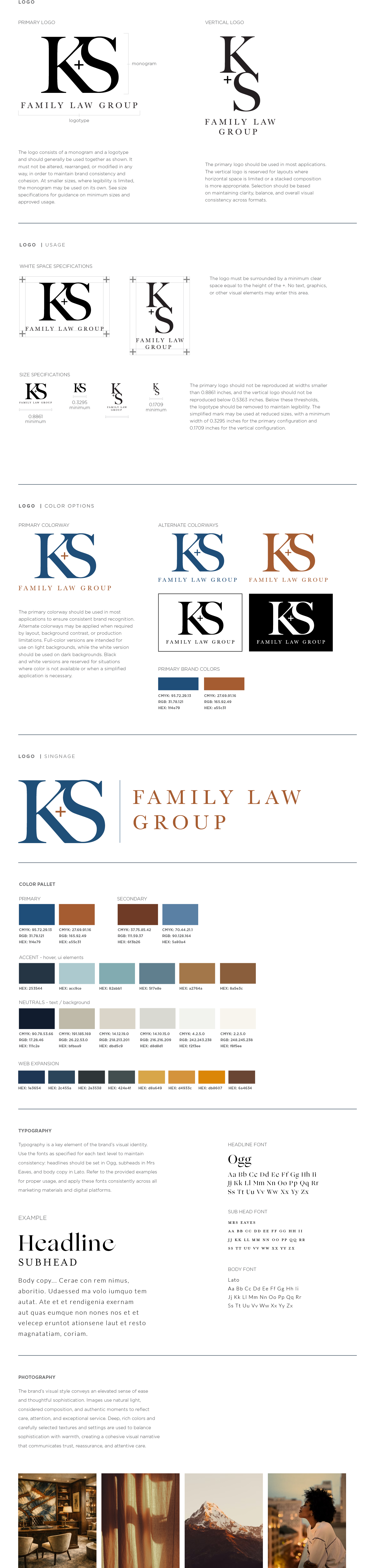
This brand identity was developed for a law firm, directed as one cohesive system across logo, color palette, typography, and applications including signage and website.
Naming
K + S Legal draws on the founders' initials, a nod to their leadership without overloading the name. The "+" signals partnership, clarity, trust, and competence.
Color & Type
A palette of deep browns and blues grounds the brand in luxury and stability, with a subtle nod to Colorado's natural landscape.
Identity System
The system carries through logo, signage, and website, creating a cohesive, memorable presence that welcomes clients into a premium, white-glove experience where their family's matters are handled thoughtfully.